Un jour, une surprise
Project Type
Illustration
Deliverables
Strategy & Research, Product Design, Frontend Developement

Introduction
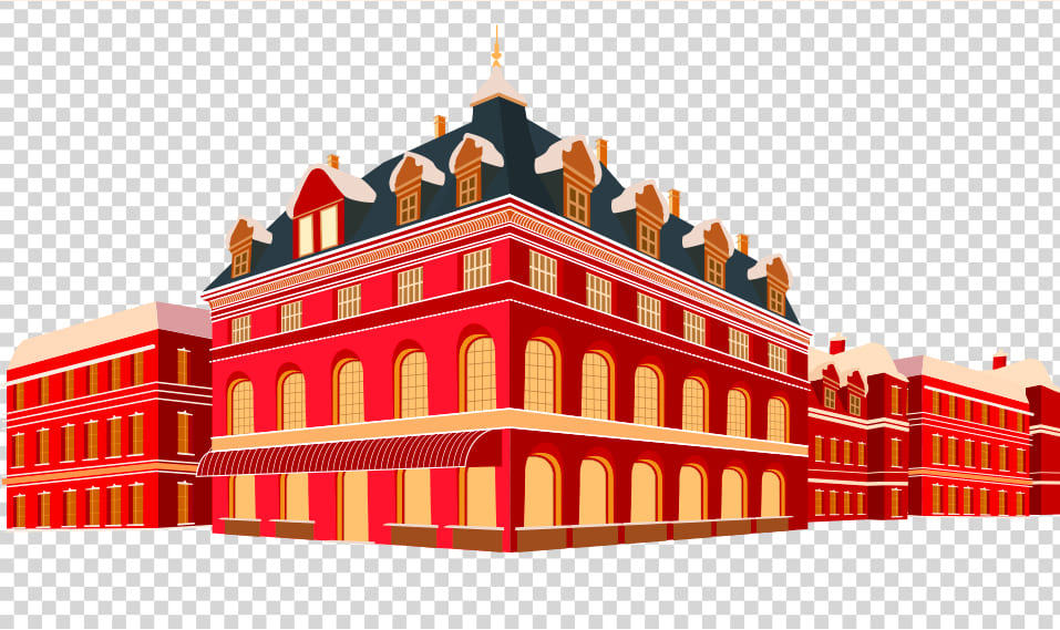
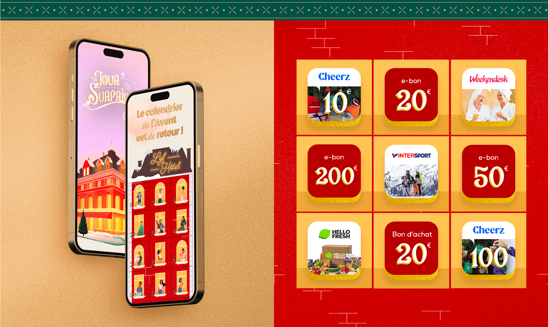
For the Christmas season, I created a gamified digital campaign combining a retro aesthetic with an interactive experience. Warm holiday tones and subtle golden accents shape the visual identity. Launched on the web and supported by social media, the campaign invites users to return daily and engage with fresh content.

Title
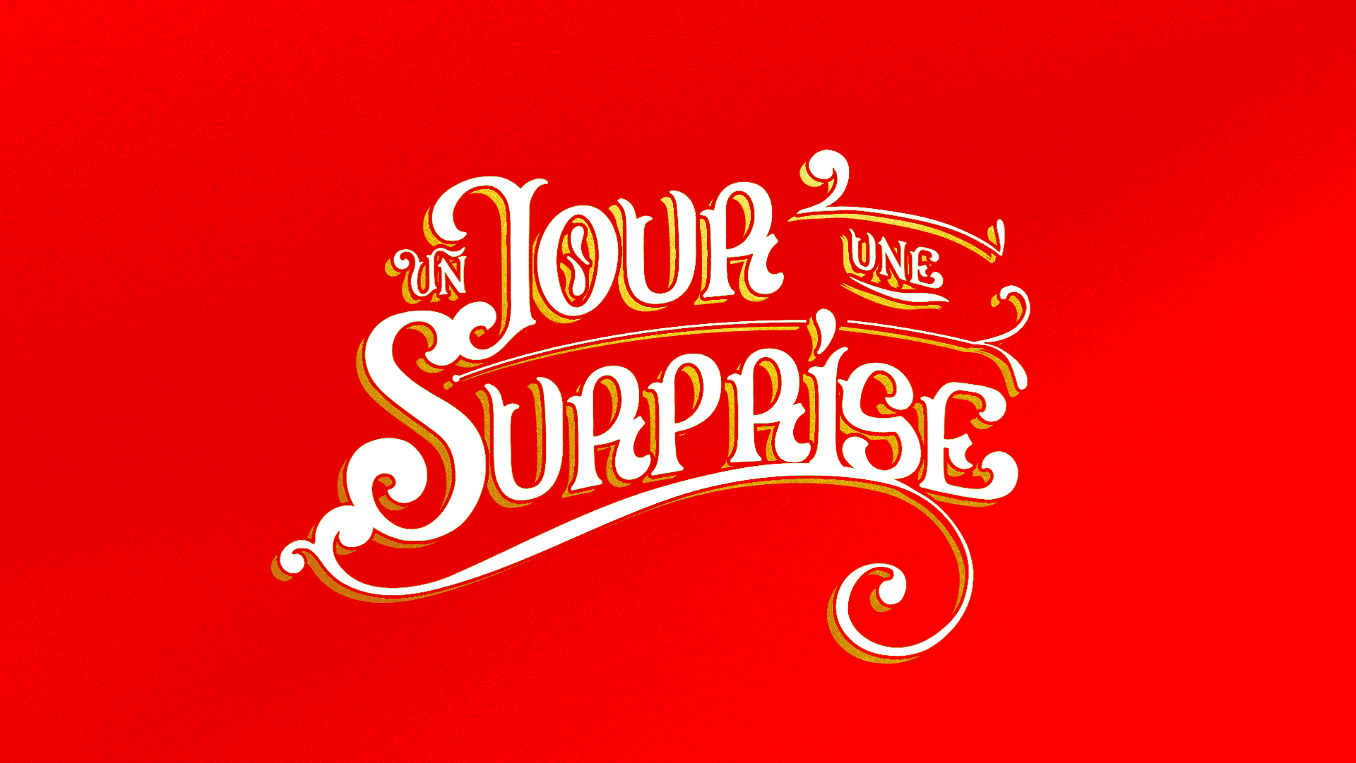
I wanted the title to evoke the aesthetic of a vintage sign, reminiscent of an old book or an early 20th-century chocolate brand. The color palette revolves primarily around Christmas tones, enhanced with a golden outline to highlight and elevate the typography.
Landing page
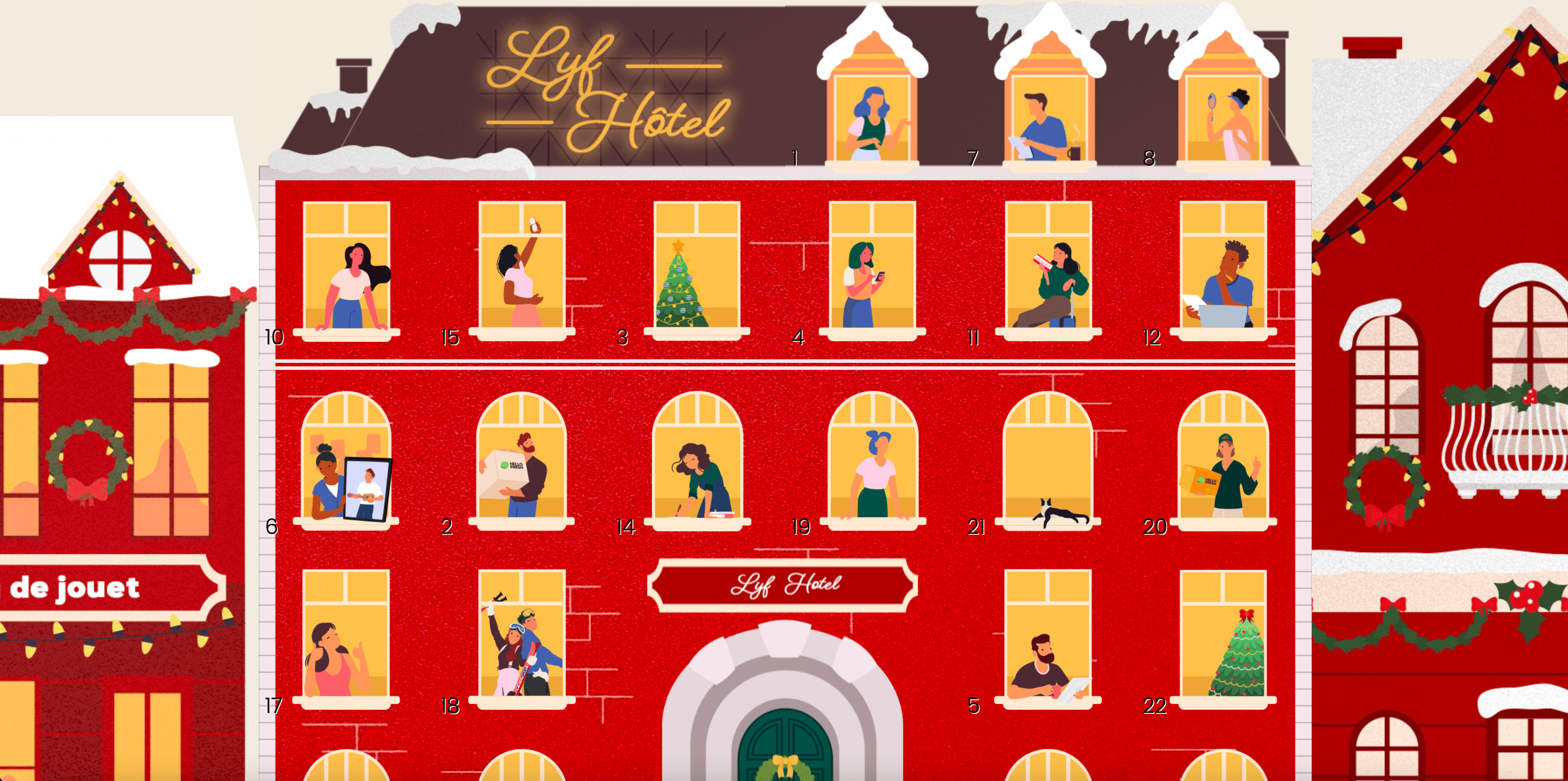
After creating the header illustration, I focused on developing the landing page, which features an Advent calendar. The goal was to faithfully recreate the experience of opening each window. With a click or a tap, each door opens to reveal its content, just like a real Advent calendar.
Next case study
•
Next case study
•
Next case study
•
Next case study
•